150 years ago, an Ohio farmer who had lost everything in a financial panic sat down at his table and drew a chart. The chart contained the years when markets would rise, the years when they would fall, and the years when panic would arrive. From 1875 to 2059. In pencil. On paper.
Academics still don’t recognize it. The chart sits in obscurity somewhere between “interesting curiosities” and “pseudoscience.” Finance professors don’t look at it, bankers don’t cite it, analysts don’t mention it.
And yet it works.
Not perfectly. Not every time. But often enough and accurately enough that anyone who wants to understand how big money moves should at least once stop and take a look.
This article is about that chart, the man who created it, and why 2026 — according to that chart — is a peak year. And why nobody listens.
I. THE MAN WHO LOST EVERYTHING
His name was Samuel Benner. A prosperous farmer and livestock operator from Dundas, near Chillicothe, Ohio. Until 1873, a man who was doing well. After 1873, a man who lost everything. The financial panic, compounded by a hog cholera epidemic that wiped out his herd.
Most people in that situation give up. Benner didn’t.
He asked himself the question that changed everything: why? Not “why me,” but “why at all?” Why does the economy move in waves? Why does prosperity always give way to collapse? Is there a regularity that can be seen?
Benner was a farmer. He understood seasons. Planting, harvest, winter, spring: a cycle that repeats regardless of who governs the country or what the banks say. He knew that in nature, cycles are a law, not a coincidence. The question was simple: do financial markets operate on the same logic?
He went to the library. He gathered price data for agricultural commodities, iron, and capital goods going back several decades. He looked for patterns. And he found them.
II. SUNSPOTS, HARVESTS, AND PRICES
Benner’s core hypothesis was radical for its time: economic cycles are connected to natural cycles. Specifically — to the sunspot cycle.
The sunspot cycle is approximately 11 years. Benner made a connection that today sounds almost absurd: Solar activity affects weather, weather affects harvests, harvests affect prices, prices affect the economy. The star on which everything depends reaches your wallet through several intermediate steps.
Is this science? In the strict sense — no. The Federal Reserve, incidentally, also studied the connection between sunspots and the economy. Results were ambiguous. But correlations exist, and Benner saw them 150 years ago without a computer, without databases, without a Bloomberg terminal. Just pencil on paper.
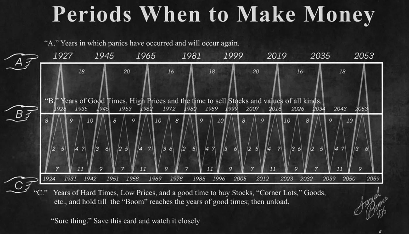
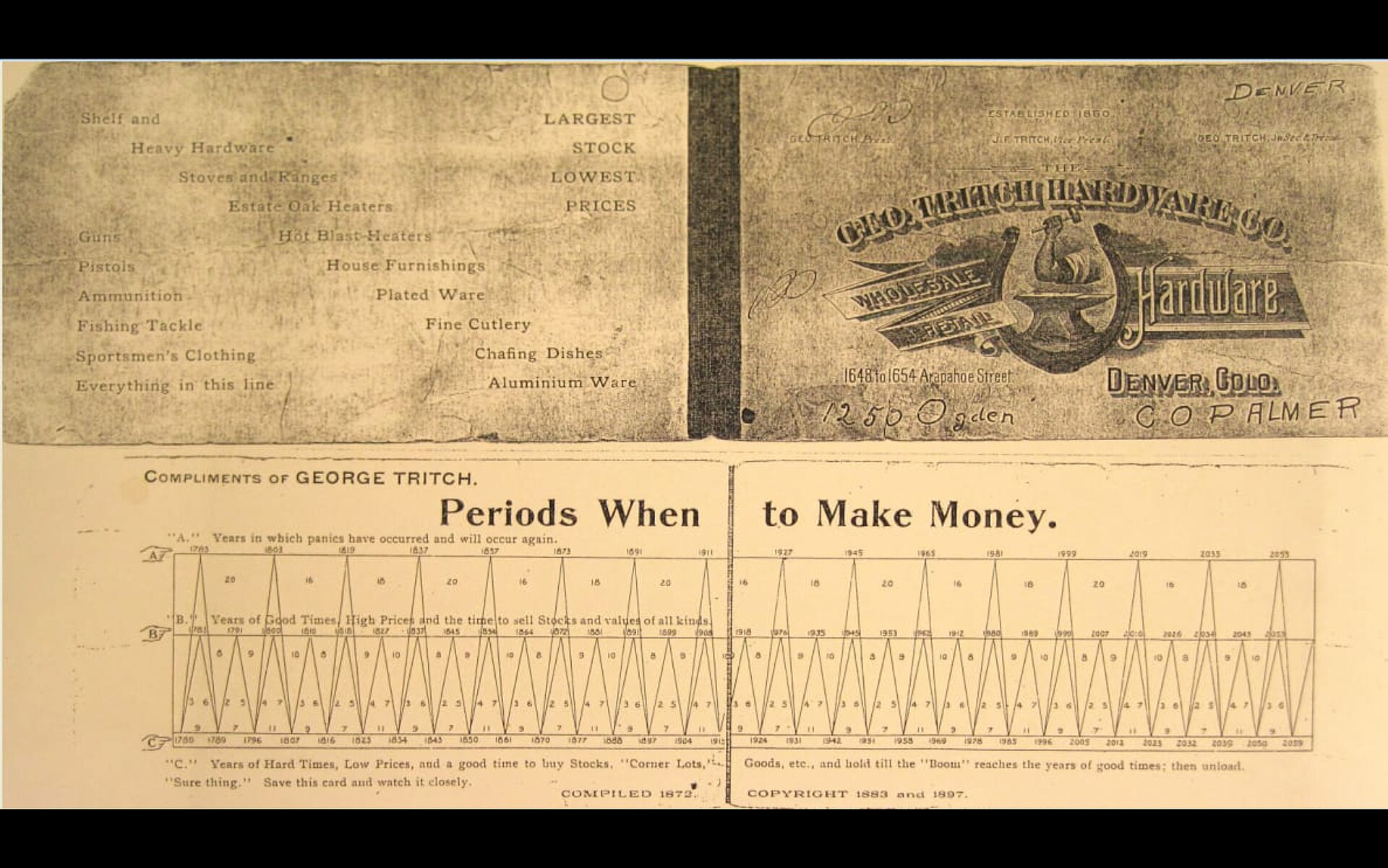
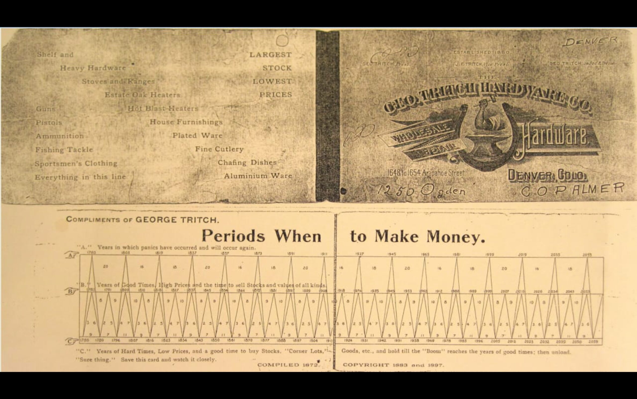
In 1875, he published a book: Benner’s Prophecies of Future Ups and Downs in Prices. It contained a chart that forecasted economic cycles from 1876 — all the way to 2059.
At the bottom of the chart, Benner wrote two words: “Sure Thing.”
III. HOW THE CHART WORKS
Benner divided time into three categories:
Good times — when prices are high, when the economy is thriving, when everyone feels invincible. This is the best time to SELL. When everyone is buying, you walk out.
Hard times — when the economy is slowing, when prices are low, but the panic has already passed. This is the time to buy and wait for the next rise.
Panics come in a cycle: roughly every 16, 18, or 20 years. After a panic, good times last about 7 years. Then a transition to hard times, about 11 years. Then recovery over about 9 years. And again from the start.
Sounds simple? Too simple? Perhaps. But let’s look at how this chart played out in reality.
IV. HISTORICAL CONFIRMATIONS
Let’s check the key data points. Benner predicted panic years around: 1891, 1907, 1929, 1945 (transition), 1965, 1982, 2001, 2019.
Now let’s look at what actually happened:
1893 — banking panic and deep recession. Two years off from Benner’s prediction.
1907 — the banking panic of 1907. Exact match.
1929 — the Great Depression begins. Exact match.
1965–1966 — the US stock market peak and start of stagflation. Near match.
1982 — the end of the great bear market, beginning of the 1980s bull run. Near match (transition point).
2001–2002 — dot-com collapse and 9/11 recession. Near match.
2019–2020 — COVID market collapse. Near match.
Did he hit everything perfectly? No. There were moments when he missed wider. There were periods when cycles shifted due to wars, central bank interventions, technological revolutions. But he hit often enough and close enough that ignoring it would be pure intellectual laziness.
A man 150 years ago, with pencil and paper, charted future markets more accurately than many modern analysts with supercomputers.
He knew it. He wrote “Sure Thing.” And died in 1913, never seeing how his chart would forecast another hundred years.
V. WHY NOBODY TAKES IT SERIOUSLY
Three reasons.
First, the mechanism isn’t clear. Modern science requires a reproducible mechanism: if A causes B, you need to explain why and how. The sunspot–economy connection hasn’t been proven to the standard of statistical significance and confidence intervals. Benner gave a chart. A chart is not a model. It has no p-value. It would not survive academic peer review, because that procedure requires a reproducible mechanism, not an empirically observed rhythm.
Second, it threatens the profession. If cycles exist and are predictable, it means central banks cannot stop them. It means all monetary policy — raising and cutting interest rates, quantitative easing and tightening — is merely an attempt to delay or accelerate what will come anyway. This is an existential threat to all modern economic theory, which rests on the premise that humans can manage the economy. That policy decisions are paramount. That the Fed can stop a recession.
Benner says: no, it can’t. It can only observe and adapt.
That is a very uncomfortable message for institutions whose entire budget depends on the belief that they matter.
Third — and this is the most honest reason — it makes analysts look bad. If a 150-year-old chart drawn by a farmer is more accurate than the best Wall Street models, that raises an awkward question: what exactly are we paying all those analysts for?
VI. 2026 — THE PEAK YEAR
According to the Benner cycle, 2026 is a “good times” peak — the top of the cycle, after which a transition to hard times begins.
Let’s be precise: this doesn’t necessarily mean everything collapses in 2026. It means we’re in a peak zone — a period when smart money is gradually exiting, when IPOs of iconic companies mark the top, when the narrative is strongest and everyone is most optimistic.
Am I saying you need to sell everything and run? No. I’m saying a 150-year-old chart is pointing in the same direction as other indicators. When several independent instruments point the same way, that’s a signal a serious person cannot ignore.
VII. BENNER IS NOT ALONE
Here’s the key point: Benner is not alone.
Ray Dalio, one of the world’s most influential investors, in his book Principles for Dealing with the Changing World Order describes the grand cycle. Empires rise and fall over approximately 250 years: debt, currency debasement, internal conflict, external conflict, reset. He places America currently in the late stage of its cycle — with debt, political polarization, and geopolitical competition all rising simultaneously.
The Strauss–Howe generational cycle places us in the Crisis phase — the Fourth Turning. The last Crisis was the 1930s–1940s: the Great Depression and World War II. Before that — the Civil War era. Each Crisis ends with a fundamental rewrite of the order. We are in the middle of that process now.
The 18.6-year real estate cycle — studied by economists from Homer Hoyt to Fred Harrison — puts us at a peak that typically precedes a major correction. Harrison predicted the 2008 crash years in advance using this cycle, and predicts a similar correction around 2026.
Elliott waves — a technical analysis framework built on the observation that markets move in predictable patterns — point to an impulse wave up, then a 3-wave correction down. Elliott waves don’t predict “when,” but “where”: at which point in the big picture we currently stand. Is this the fifth wave, the last before a correction? Or the third, the strongest and most accelerated? There is room for interpretation, but the pattern repeats at every timescale.
The unemployment rate historically has never lied. When unemployment starts rising after a long climb, recession is already here — even if not yet officially declared. Analyst Sven Henrich (NorthmanTrader) argues that M2 liquidity release created the last up-wave, and that avoiding a break point in the first half of 2026 will be difficult.
Benner saw corn and iron prices. We see oil, drones, crypto, IPOs and central banks. The scales have changed. The logic hasn’t.
Cycles don’t stop because the world has become more complex. They operate precisely because complexity causes the same human patterns to repeat — fear, greed, overextension, collapse, rebuilding.
Human brains are pattern-seeking machines: we see faces in clouds, figures in constellations, and schemas in financial markets — even where they don’t exist. But okay. It’s possible that Benner hit partly by coincidence, observation, and the willingness to believe in a pattern when no one else did.
SpaceX IPO. The largest IPO in history, right in Benner’s peak window. The dot-com era taught that the biggest IPOs appear at the top of the cycle: buyers were optimistic, money was easy, and “smart money” had already exited. A large portion of the damage was already done before it was officially announced.
Every time someone says “this time it’s different,” the cycle returns and reminds them it isn’t. Never was. And never will be.
The farmer from Ohio knew this. With pencil and paper.
And we have Bloomberg terminals and the internet. And I’m still not as certain as he was. Not yet — until I see how it plays out when it happens.
If this text prompted you to think differently, pass it on. — Meška, UNWIND
Sources / Further reading ▸
Primary source
- Samuel Benner, “Benner’s Prophecies of Future Ups and Downs in Prices” (1875). Original digitized by the Library of Congress and archive.org.
Historical data for comparison
- NBER U.S. Business Cycle Expansions and Contractions (1854–present)
- Robert Shiller, “Irrational Exuberance” (2000, 2015) — long-term equity data
- Edward Dewey, “Cycles: The Mysterious Forces That Trigger Events” (1971) — work of the Foundation for the Study of Cycles
Context
- Martin Armstrong, Economic Confidence Model — a modern take on cycle forecasting
- Ray Dalio, “The Changing World Order” (2021) — long-term cycles of empires
- Charles Kindleberger, “Manias, Panics, and Crashes” — the history of financial panics